Disciplines
- Brand Identity
- Brand Strategy
Team
- Chelsea
- Aemon
- Sarah
- Emily
Industry
- Corporate
- For Purpose
Year
- 2023
The Different Co.
The Different Co. are shaping the way people, workplaces and culture view work, life and purpose. By enriching workplaces, championing individuals, and influencing culture The Different Co. are helping create a world where people, workplaces and communities thrive.
Our team recently partnered with Reventure, a human resources think-tank to rebuild their brand and corporate strategy from the ground up. This included a new name, new messaging and a new identity.




Challenge
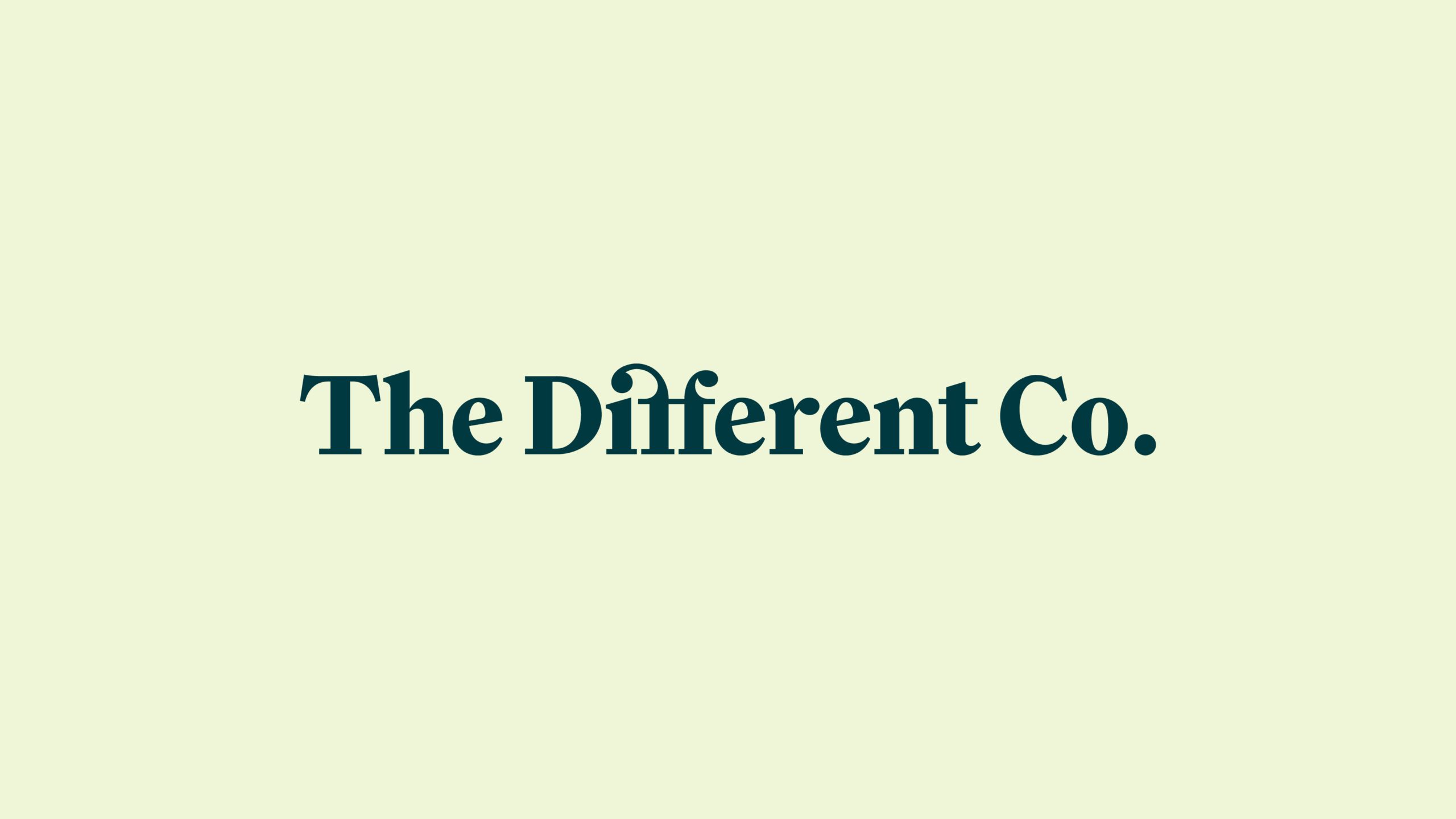
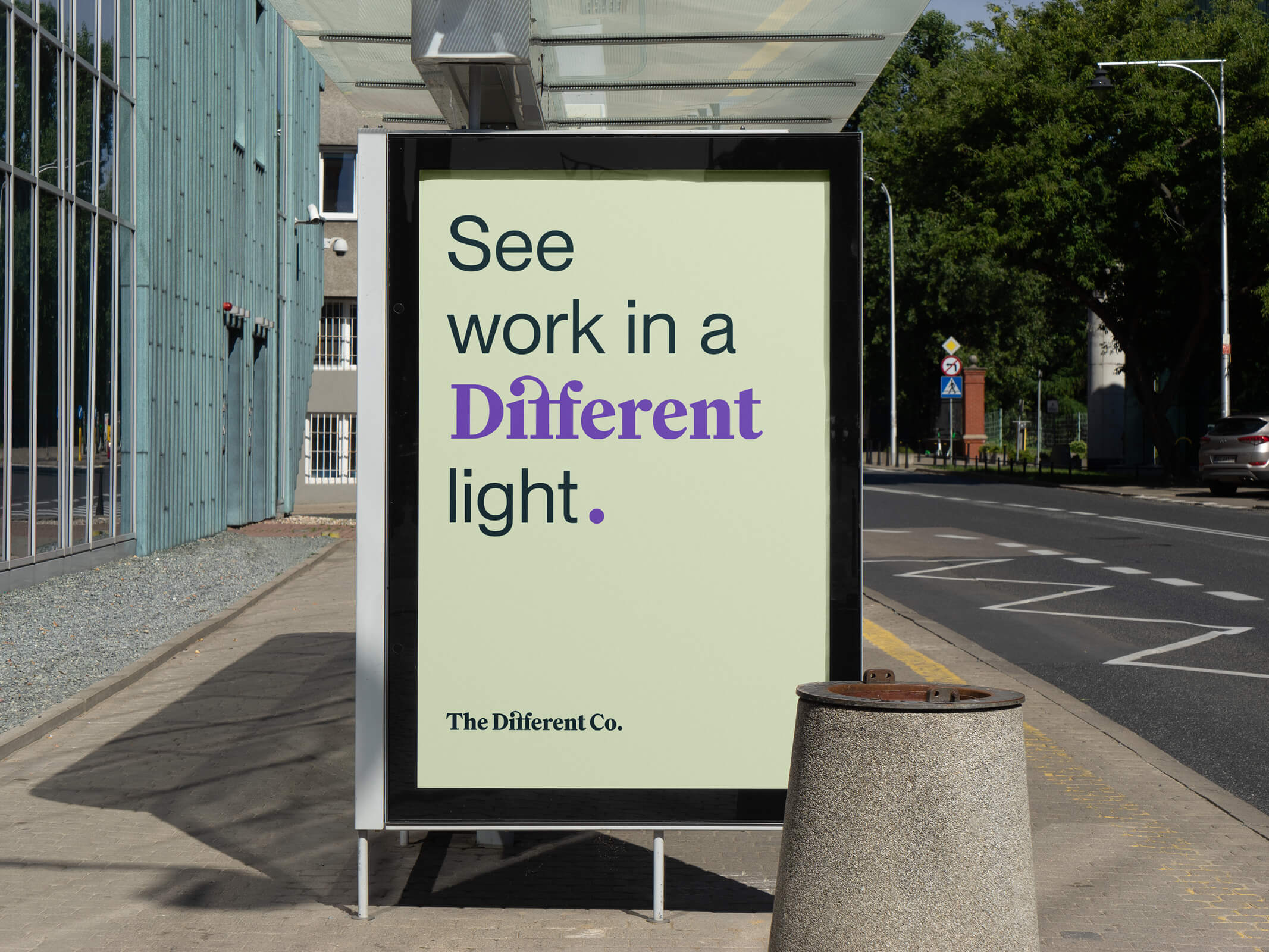
After several rounds of name exploration, the client settled on the name The Different Co. The immediate challenge was to create something that had a true point of difference as the name alone would feel generic.
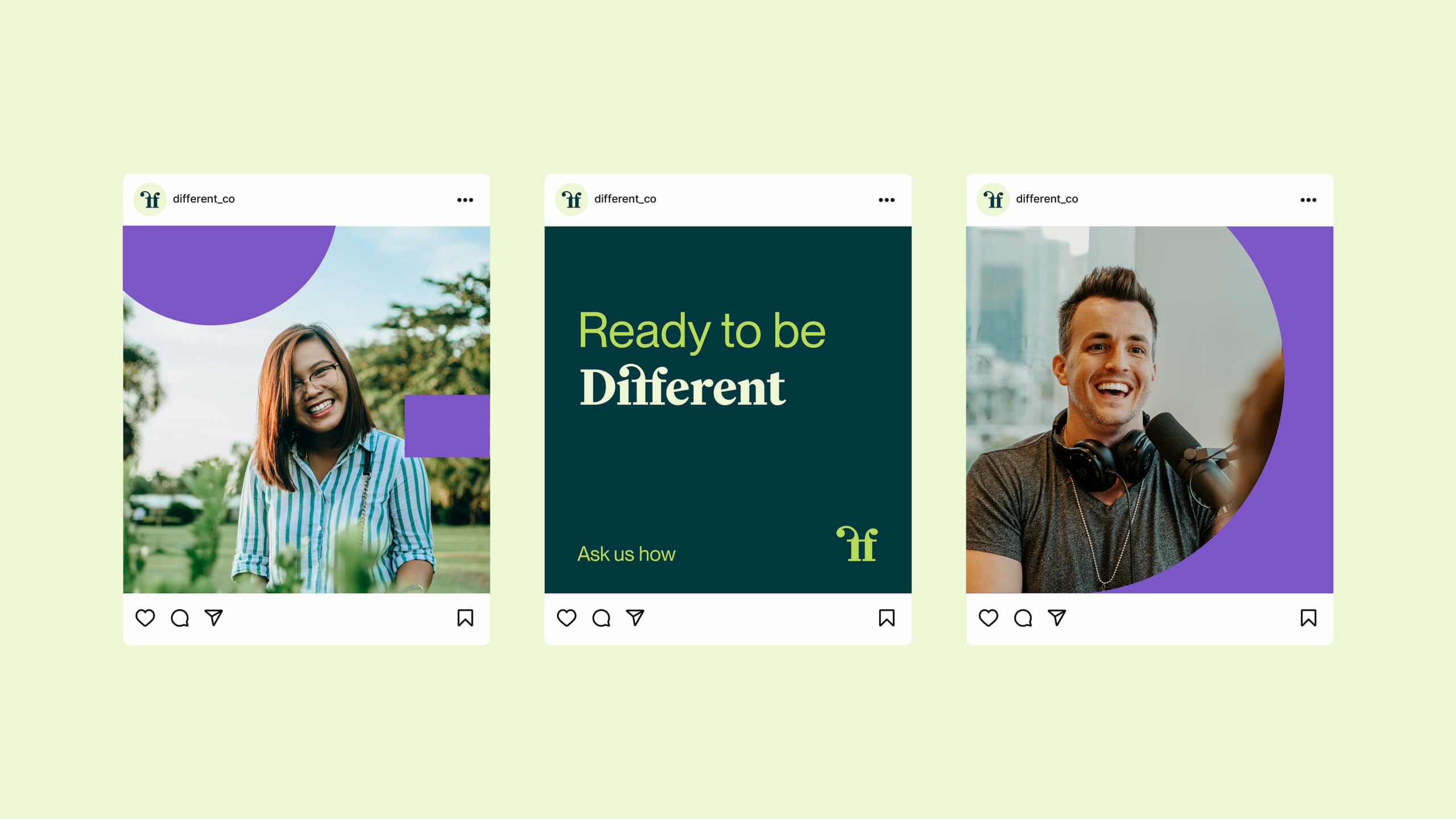
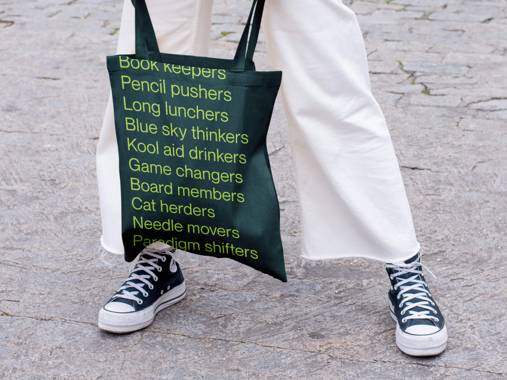
By combining bold colour, typography and shape with positive imagery the brand aimed to champion the individual, enrich workplaces, and influence culture.


Solution
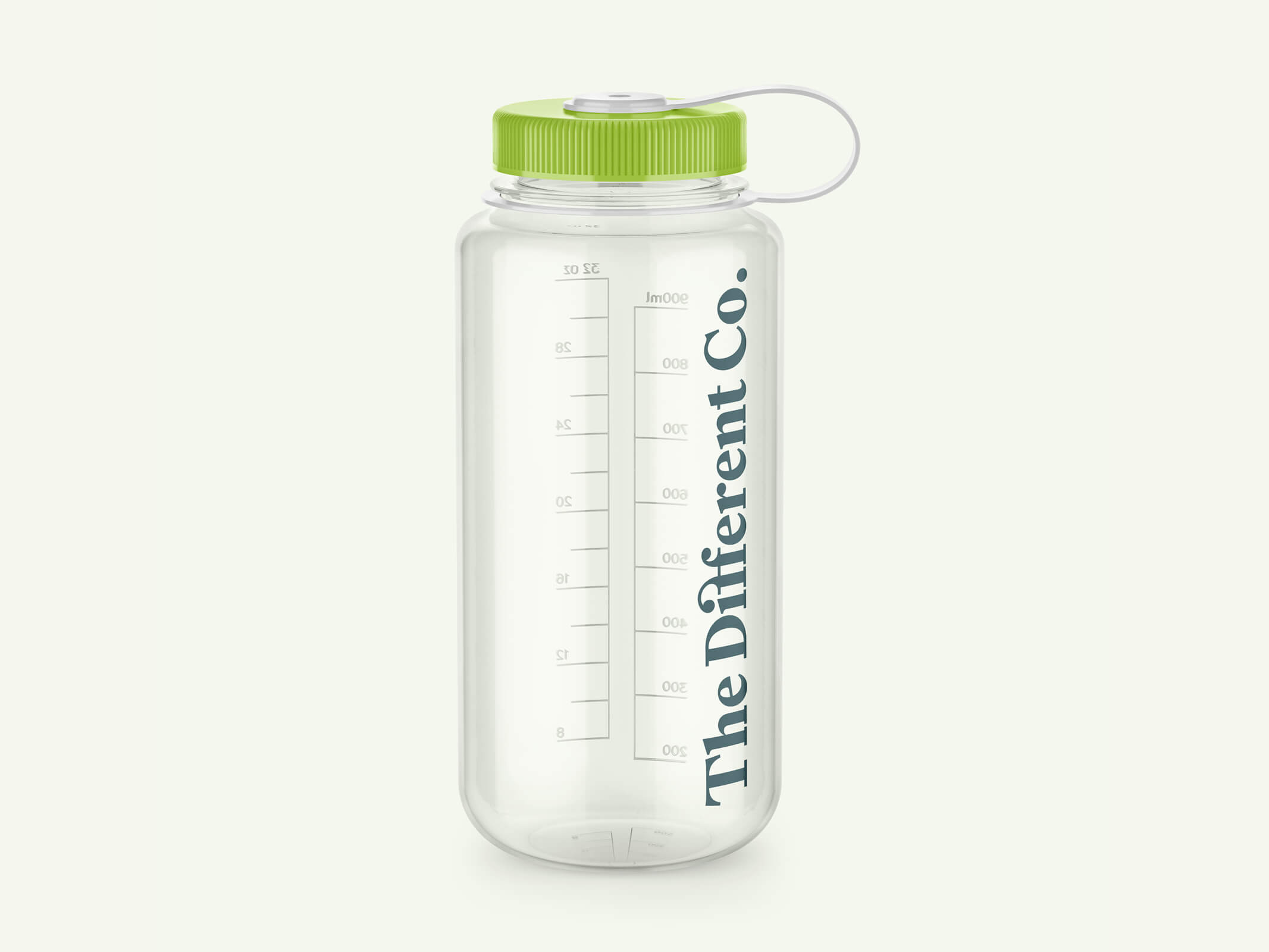
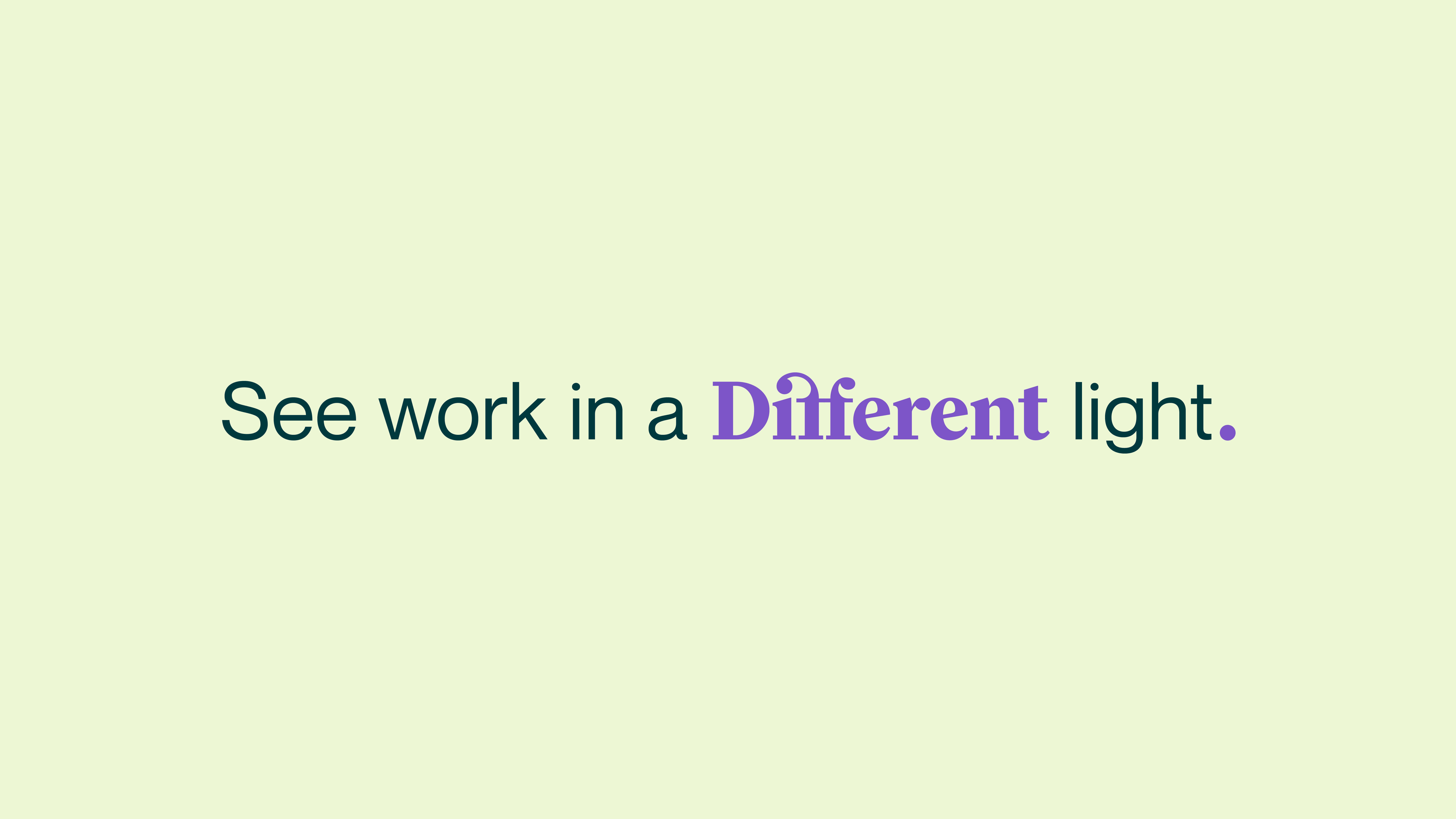
Our final brand concept features a bold typographic treatment. The serif typeface gives an authentic and genuine feel. A clever flip and manipulation of the “f” creates the idea of going against the flow to create change. It also gives the sense of nurture and care, while also standing tall and strong in collaboration with its partners.
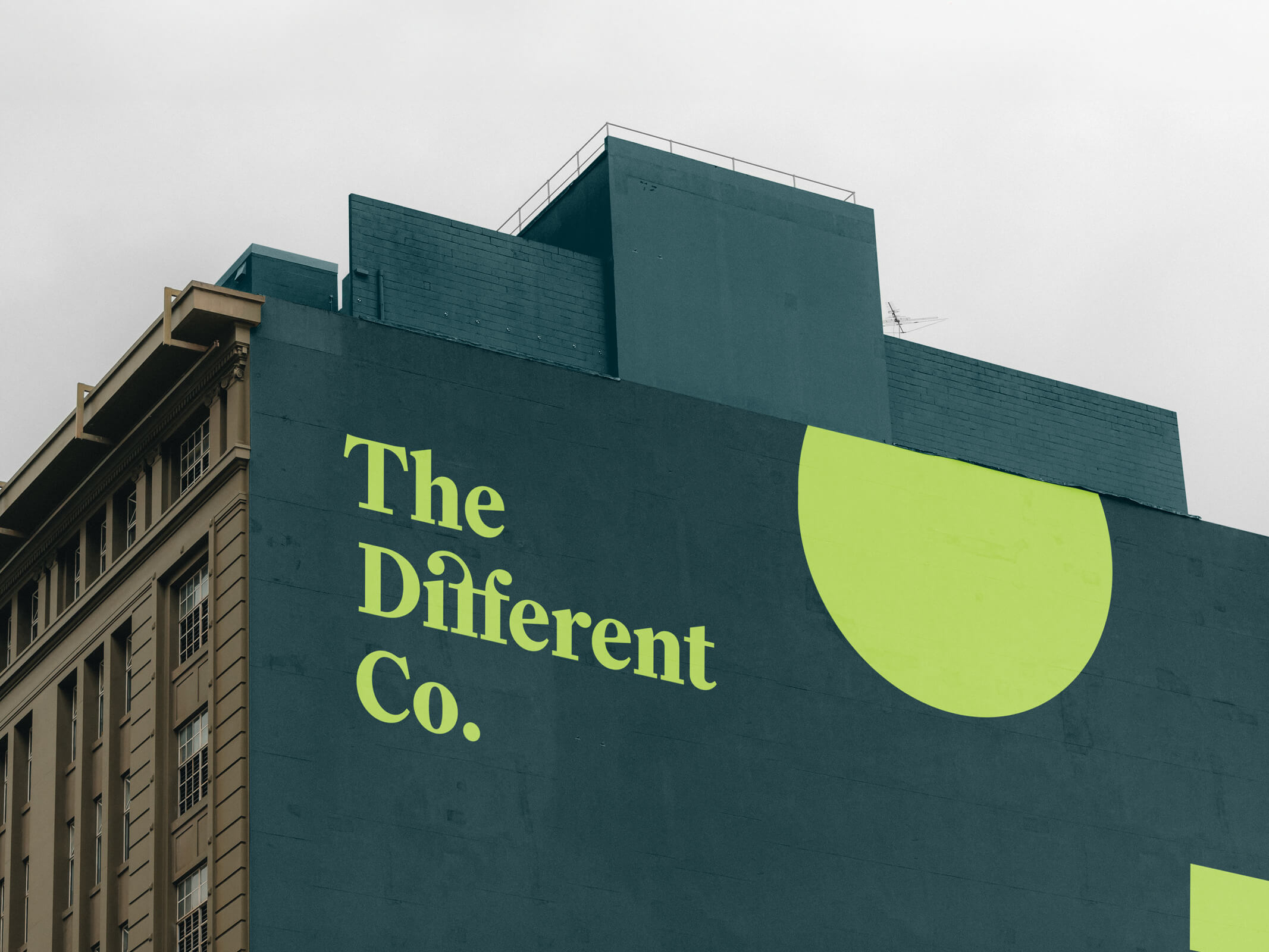
The colour palette is bold, with the brighter green giving a sense of growth and thriving, while the darker shade maintains an authenticity. The purple creates energy and a sense of ambition, while the pink provides a nurturing human element.
The shift in scale of the ff across collateral offers a sense of bold confidence, positioning The Different Co. as leaders in their field with an energetic and positive approach.

