






Disciplines
- Brand Identity
- Digital Strategy
- Web Design
- UX/UI Design
Team
- Aemon
- Chelsea
- Emily
- Lachlan
Industry
- Social & Community
Year
- 2024
Payton Foundation
The Payton Foundation connects donors with causes to drive transformation in health, housing, and education.
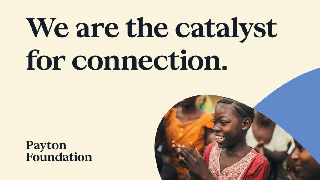
We worked with the Payton Foundation team on a full rebrand and reposition.
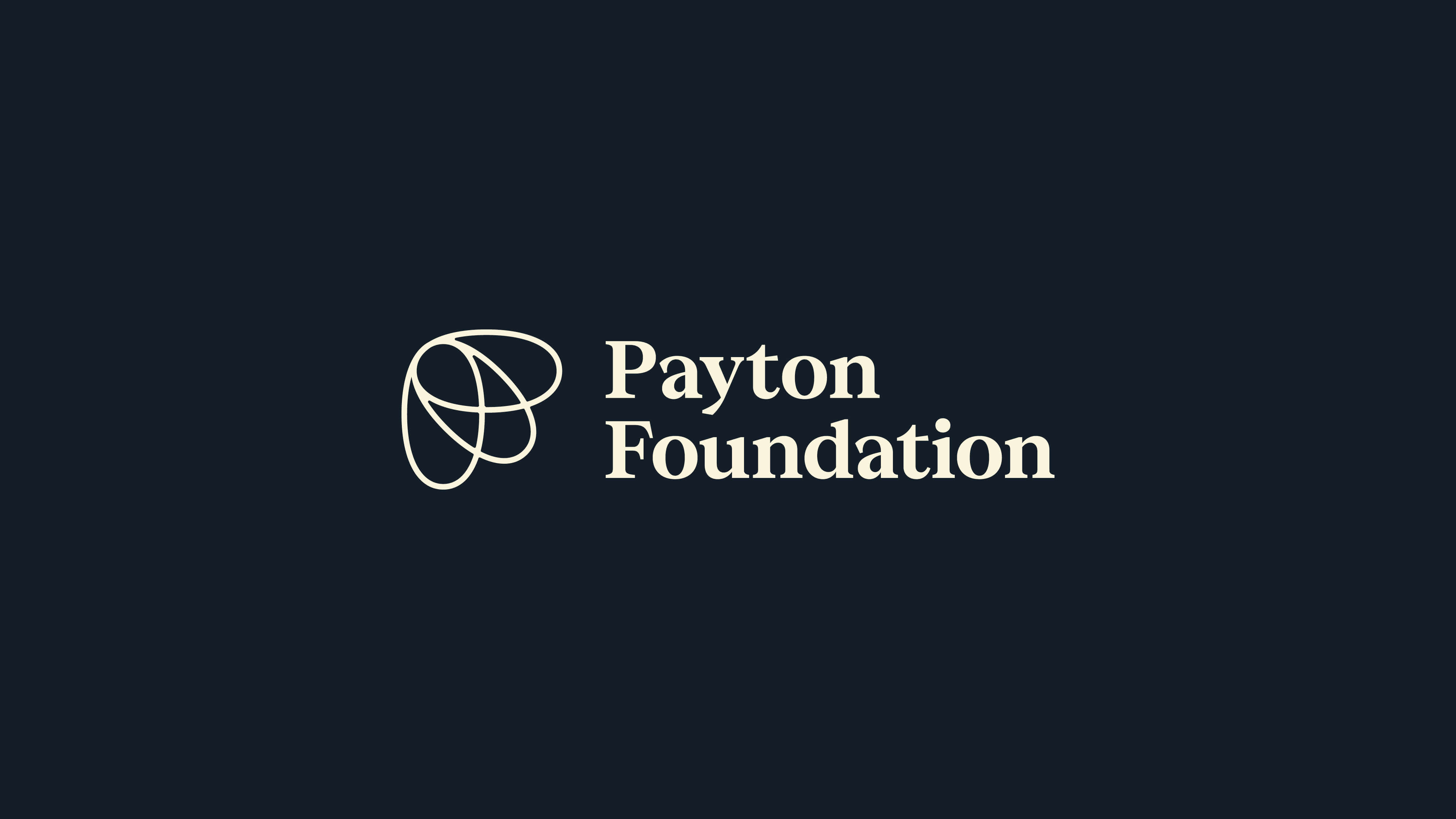
The mark brings together multiple shapes, to signify the idea of collective impact and connection. Coming together the shapes form a P and F and the shape of a moth, which is a symbol of change and transformation.
The mark is combined with a serif font that offers a genuine professional feel.
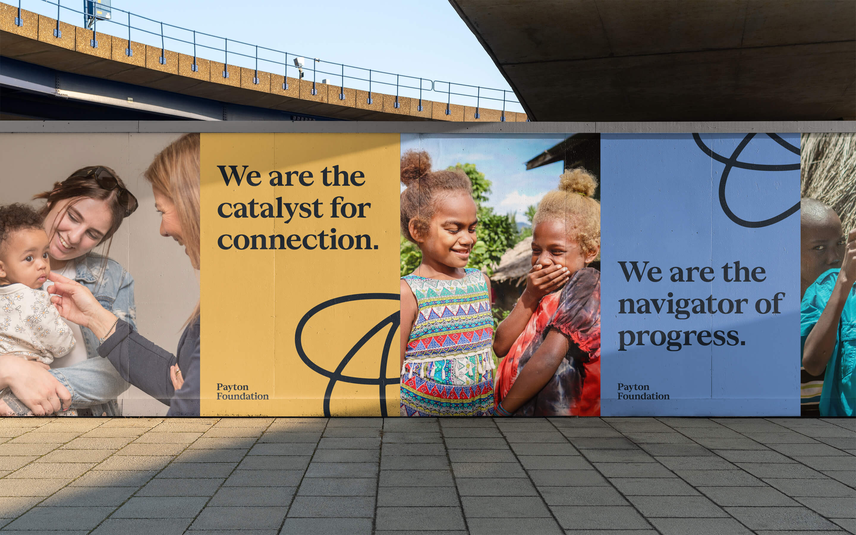
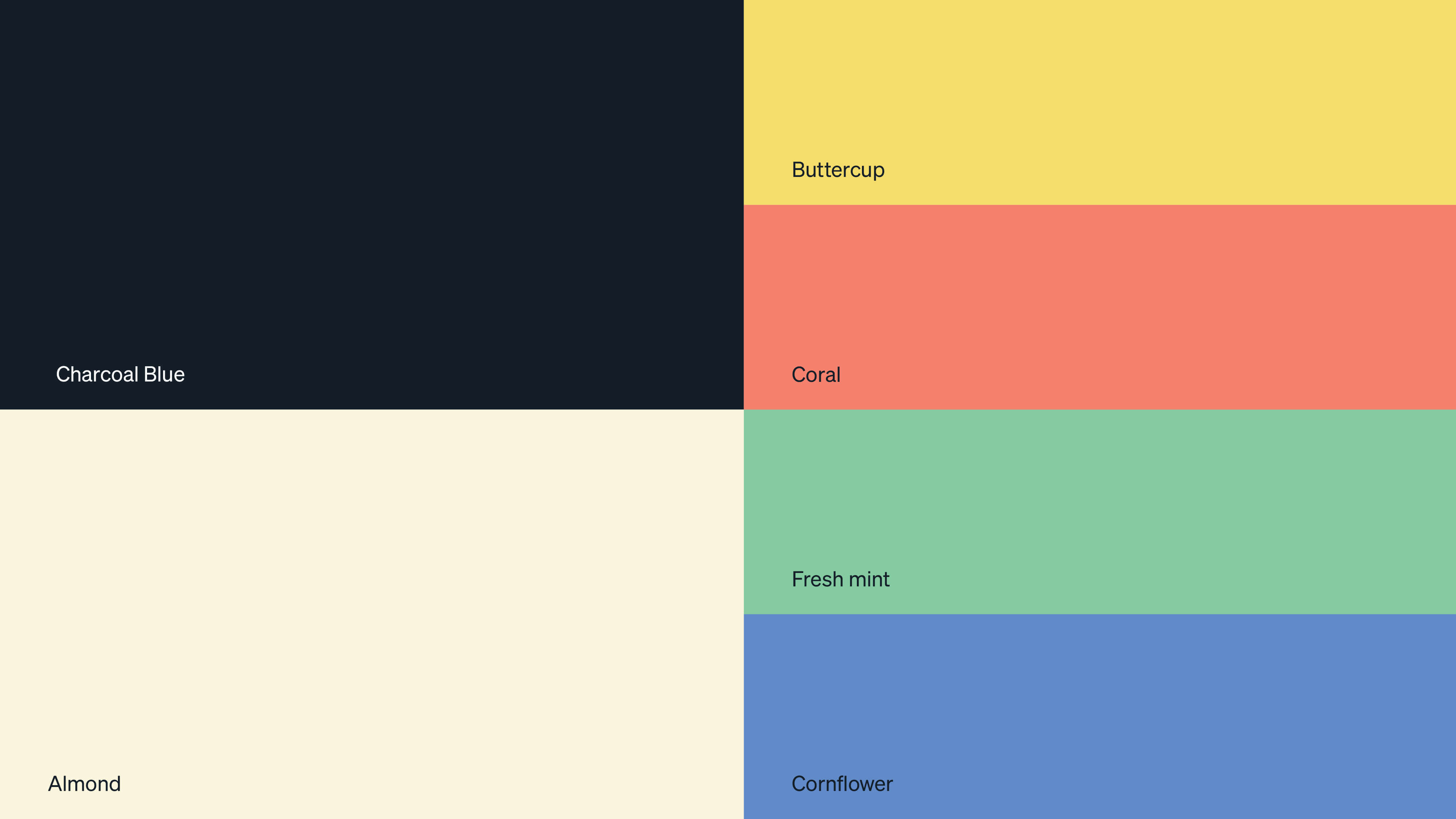
The colour palette is positive and progressive but can also be pared back to a more professional palette where appropriate.
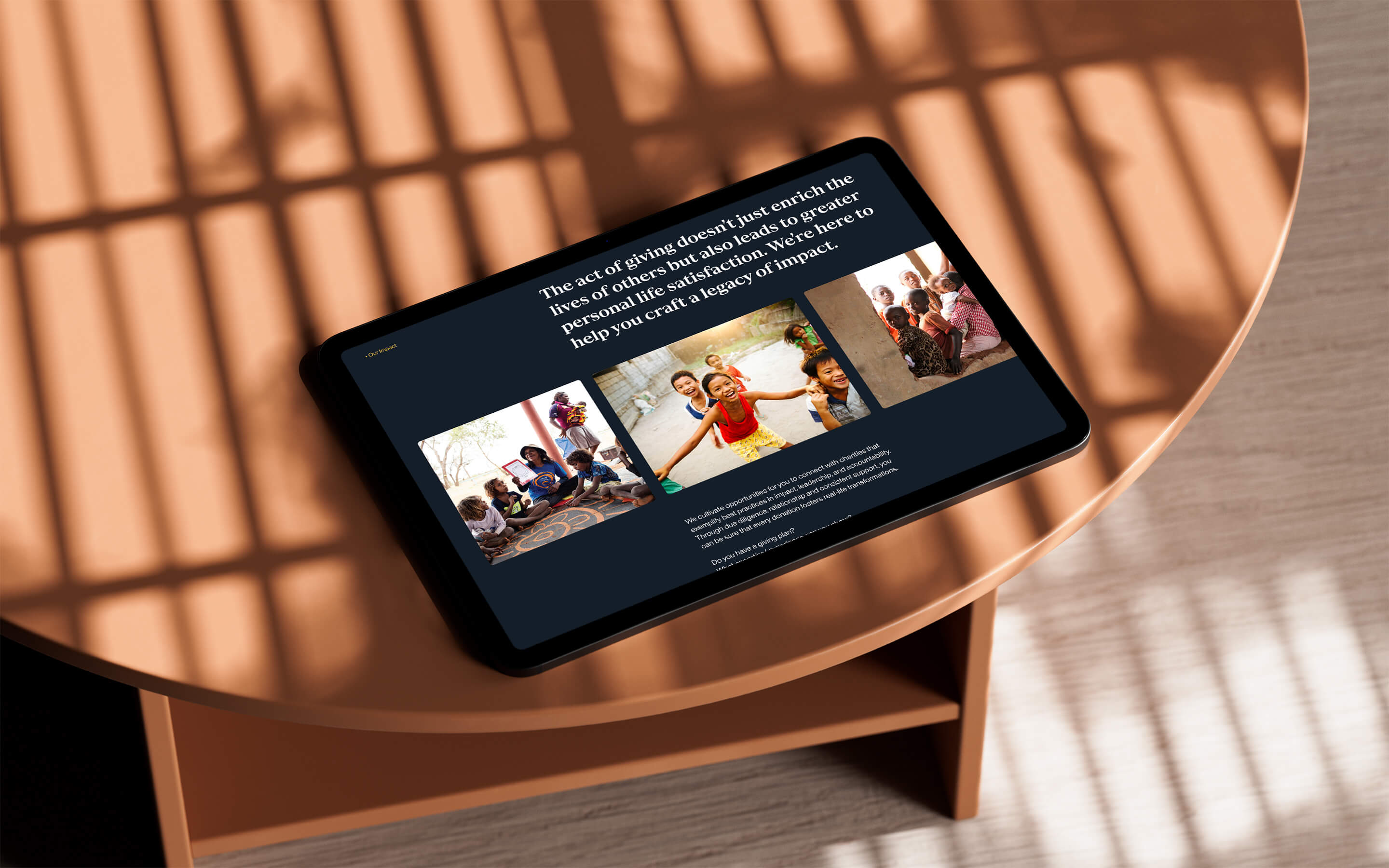
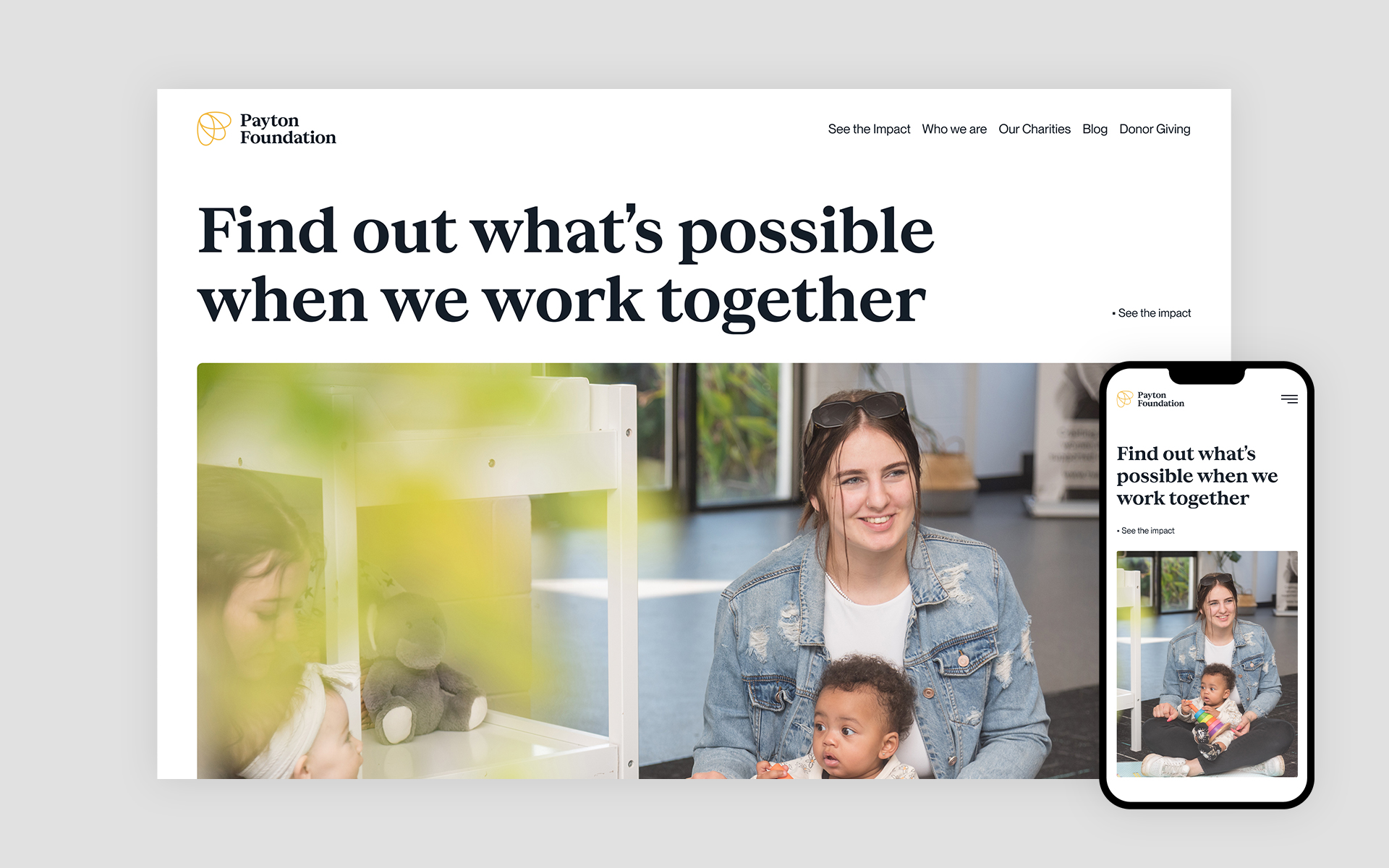
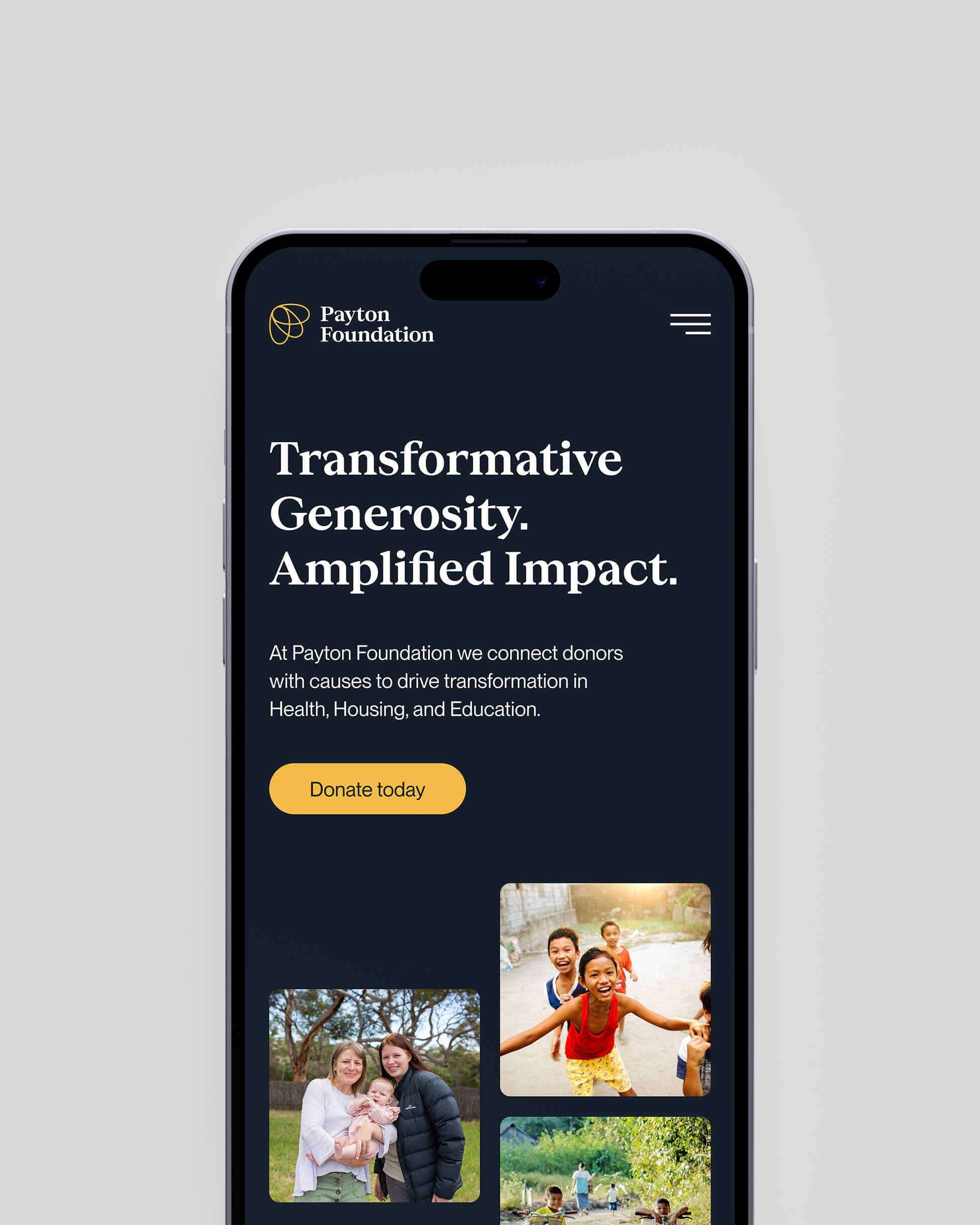
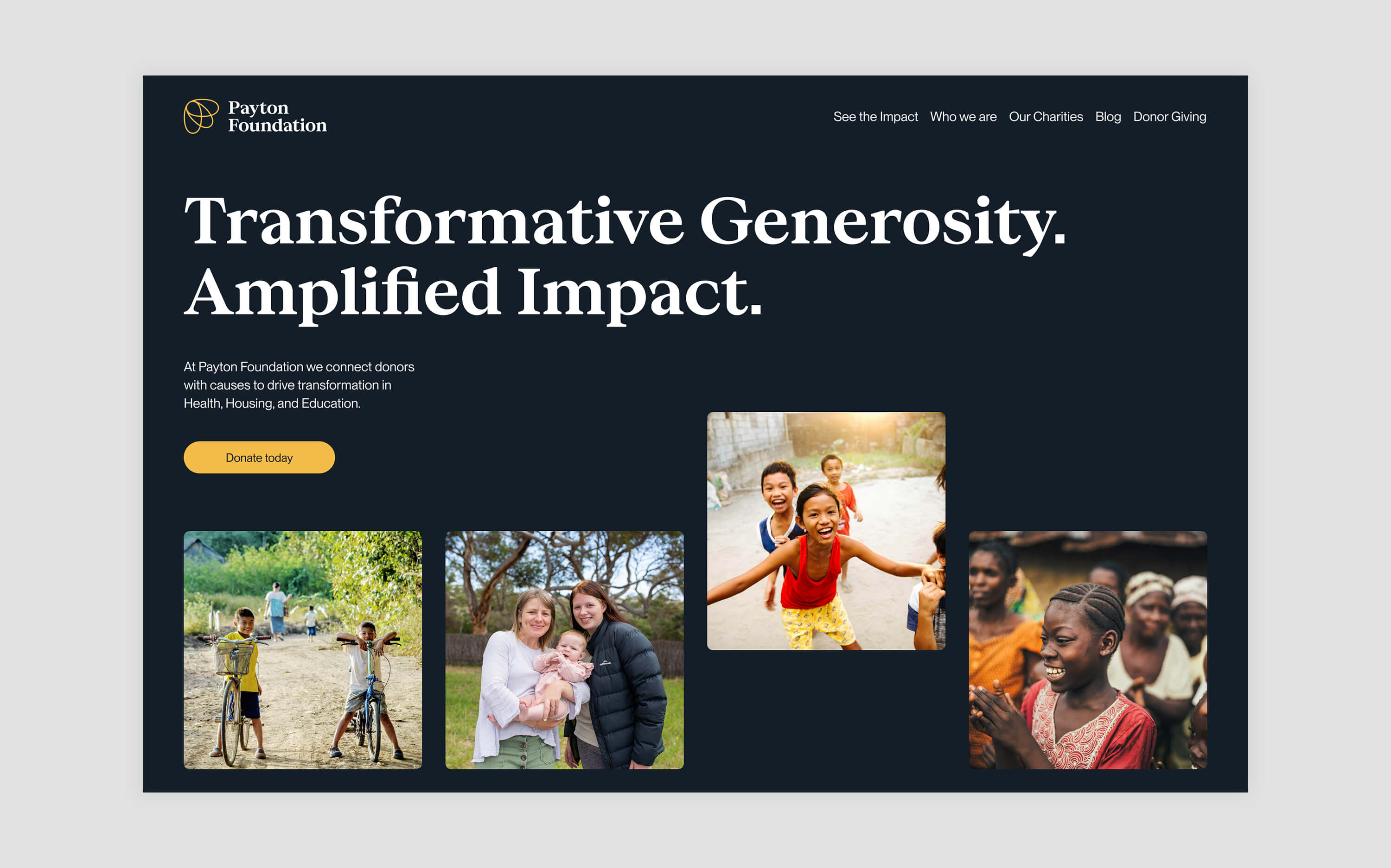
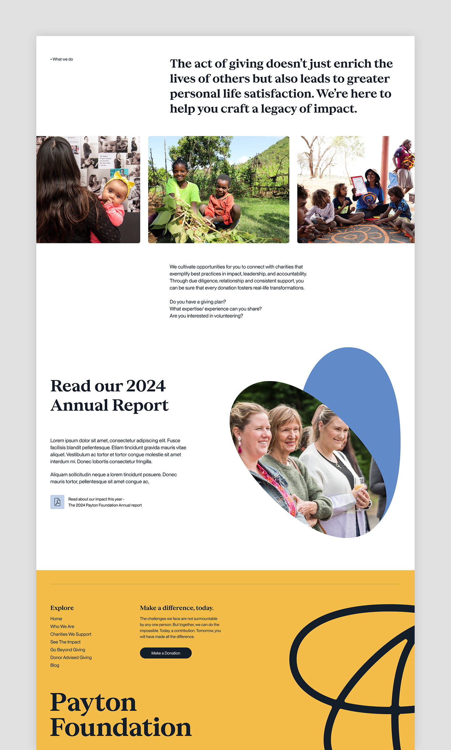
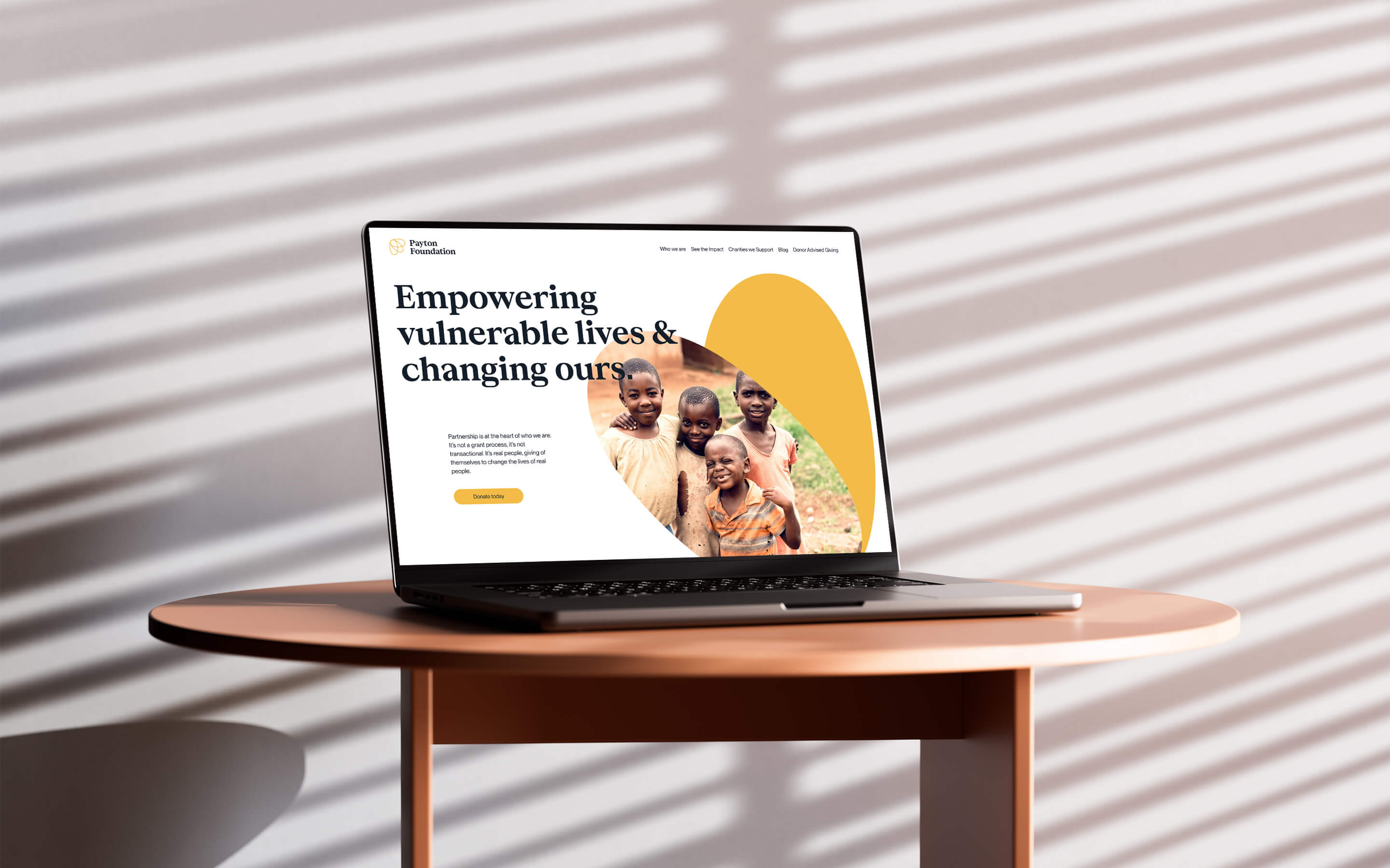
The website offers a central location where the team can highlight the organisations they are partnering with and invite others to join them in supporting their work.