






Disciplines
- Brand Identity
Team
- Chelsea
- Aemon
- Emily
- Lachlan
Industry
- Education
Year
- 2026
Astelier
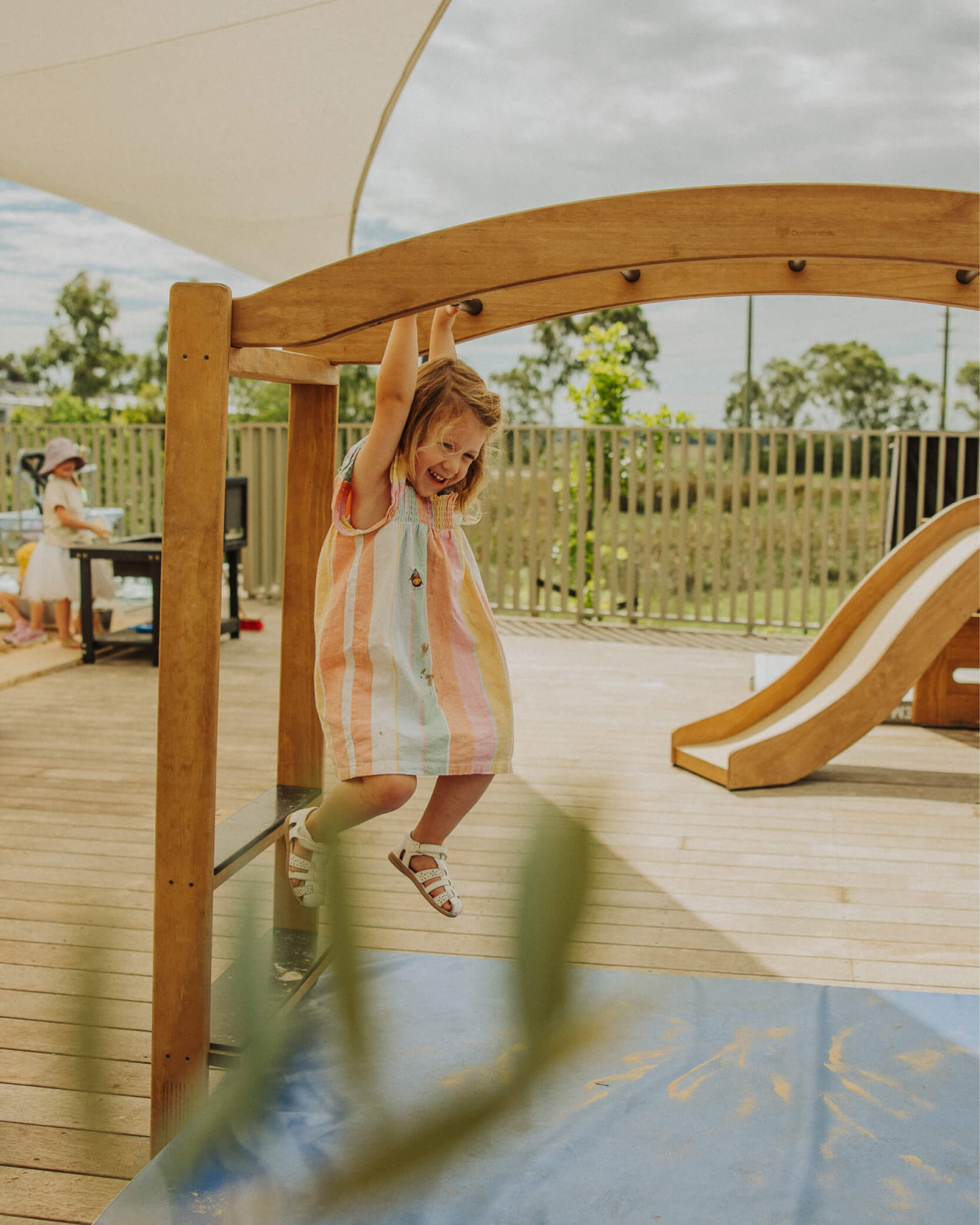
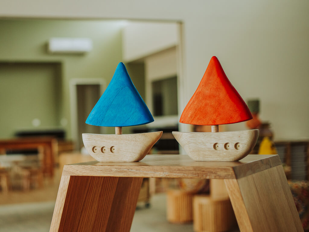
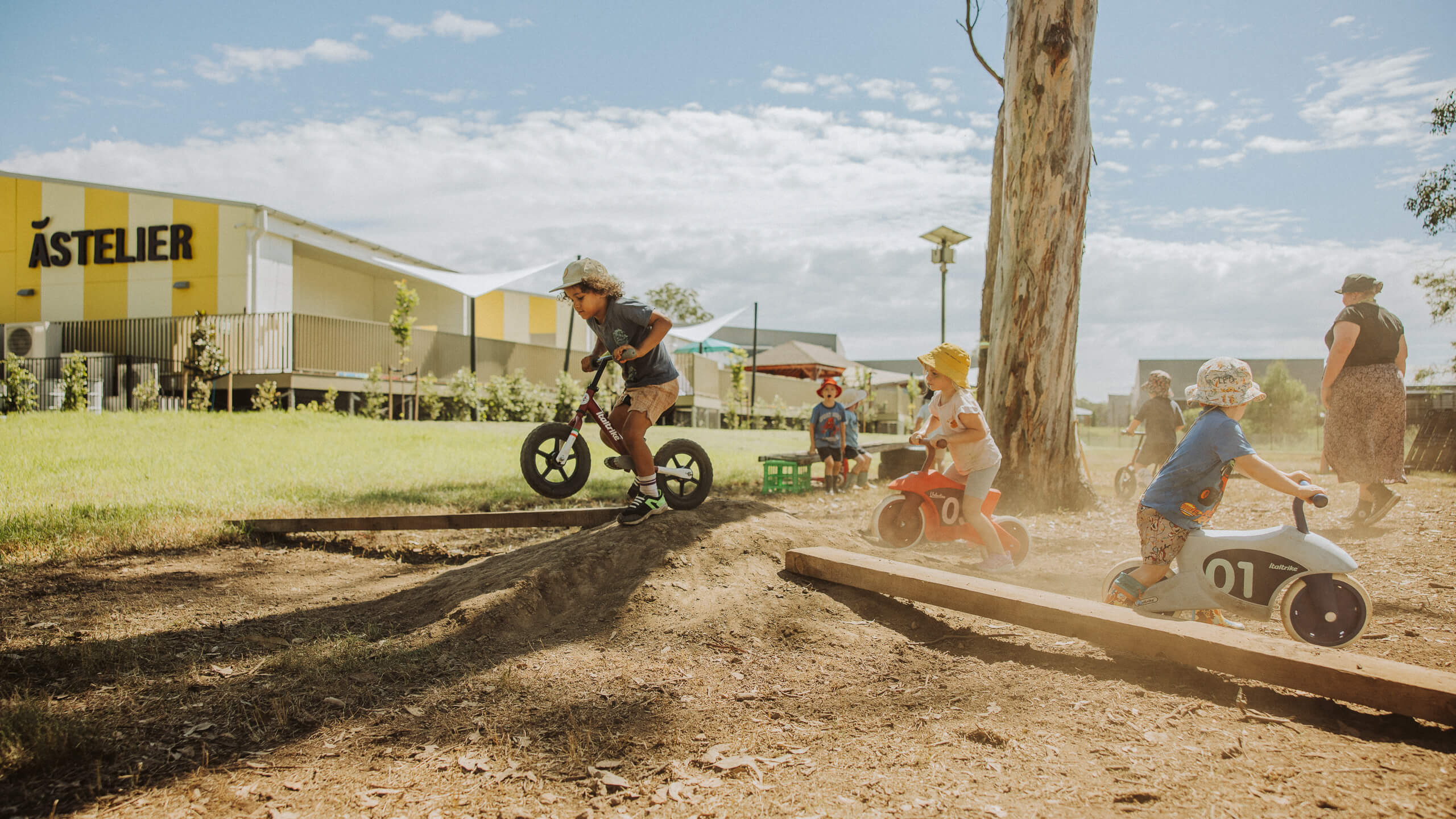
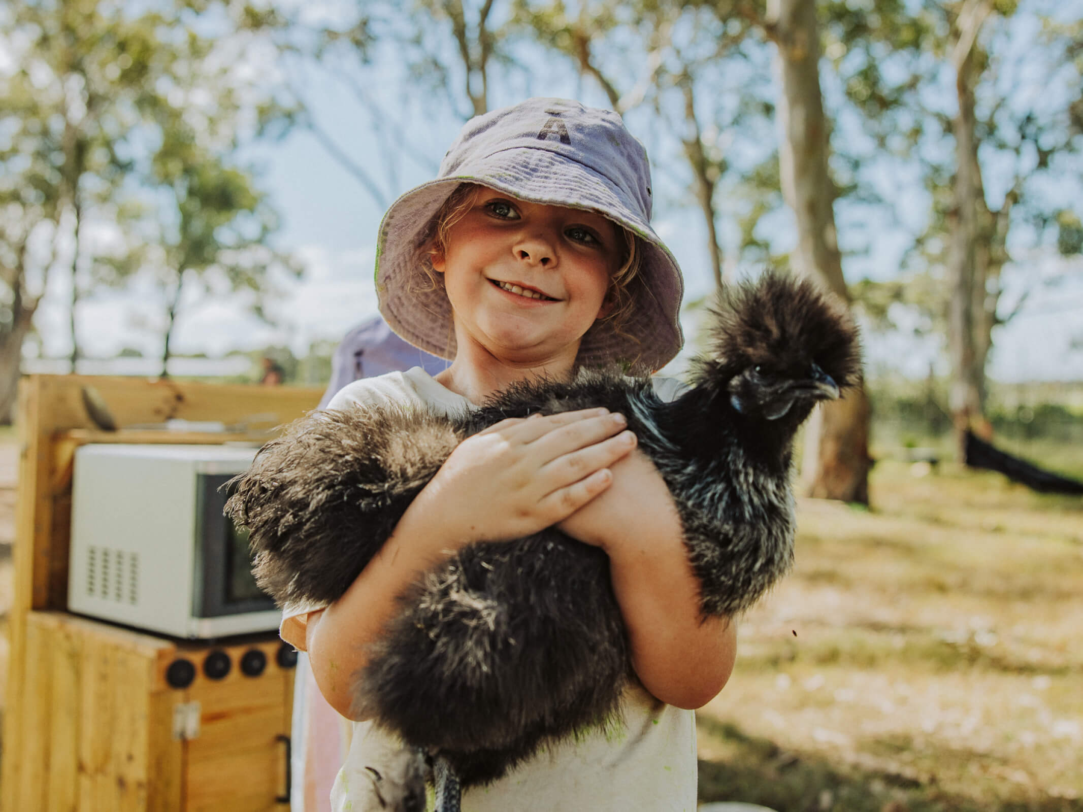
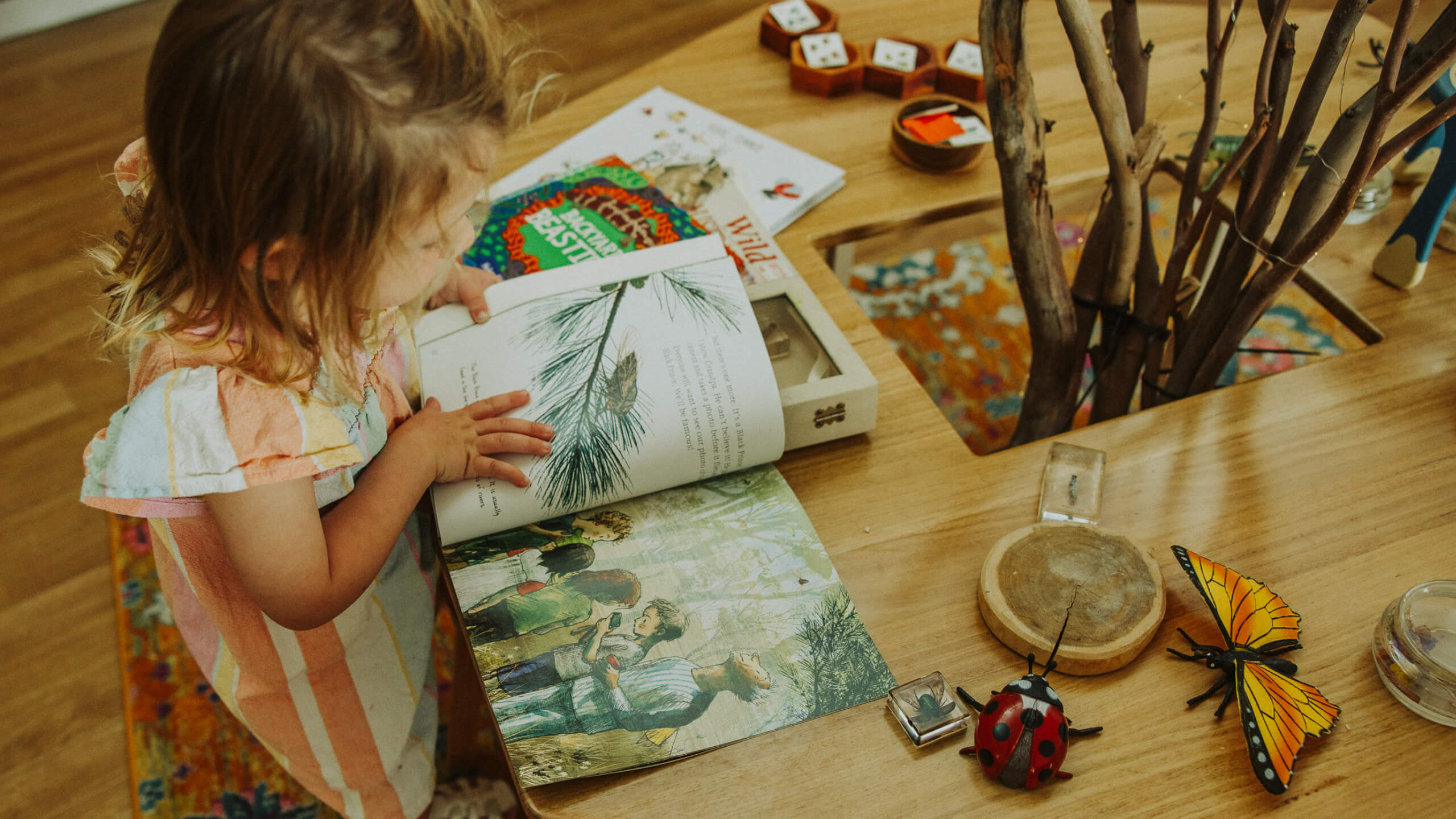
The founders of Astelier came to us with a feeling more than a brief: a children’s centre that runs like a long Italian Sunday lunch. Unhurried, generous, hands busy, everyone welcome. Somewhere that doesn’t just prepare children for school, but for a full life.
With plans to roll out a series of brand-new centres across the Maitland-Newcastle region, they needed a brand that could hold that feeling, and give parents something to actually feel when they chose it.
Challenge
Early childhood education is a saturated space, and most of it looks the same: primary colours, plastic, and a promise of school readiness. Astelier was never going to win by being a louder version of that. It needed to be a warmer one.
The challenge wasn’t a name and a logo. It was building an identity warm enough that a parent would want to spend the day there themselves, and strong enough to carry through every centre they’d open next.
Solution
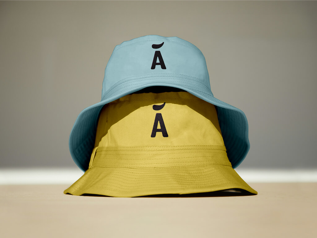
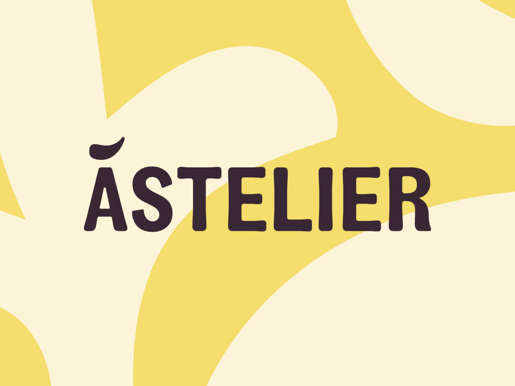
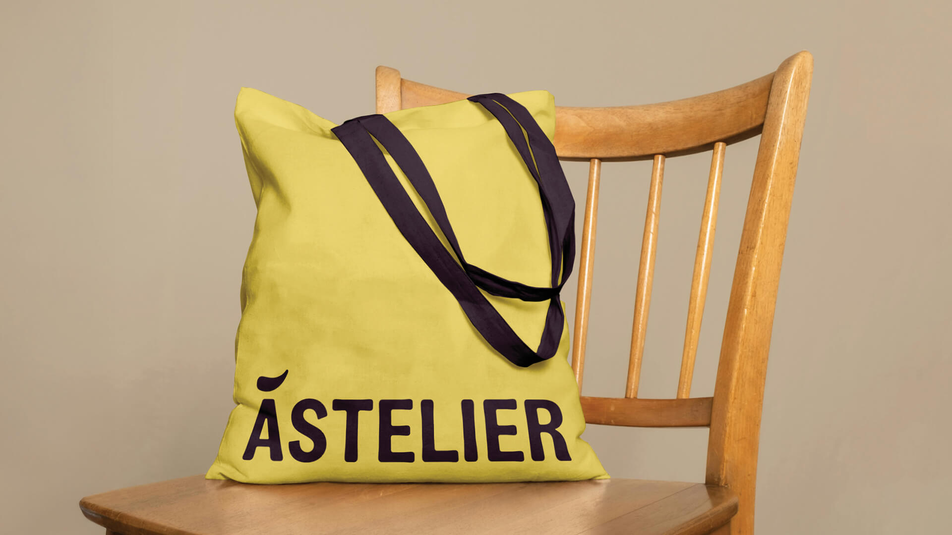
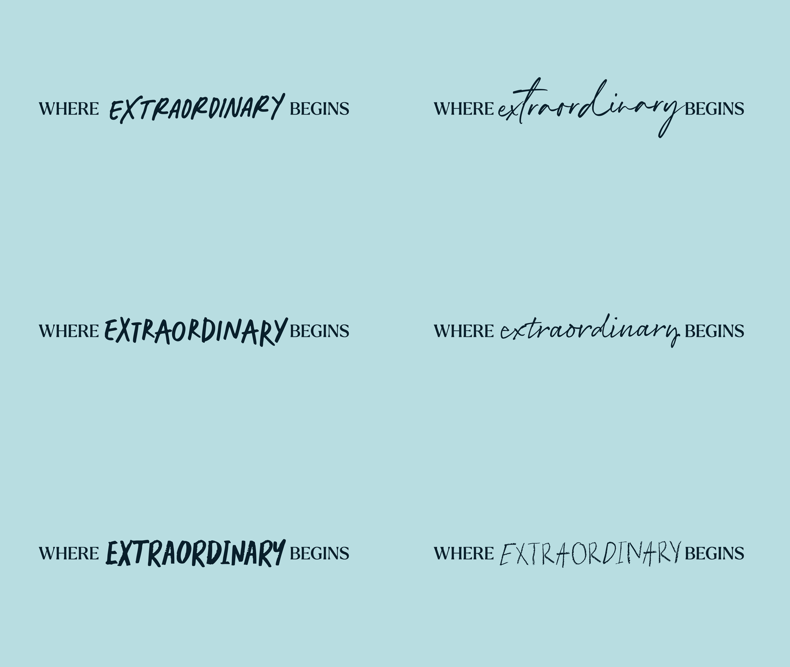
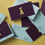
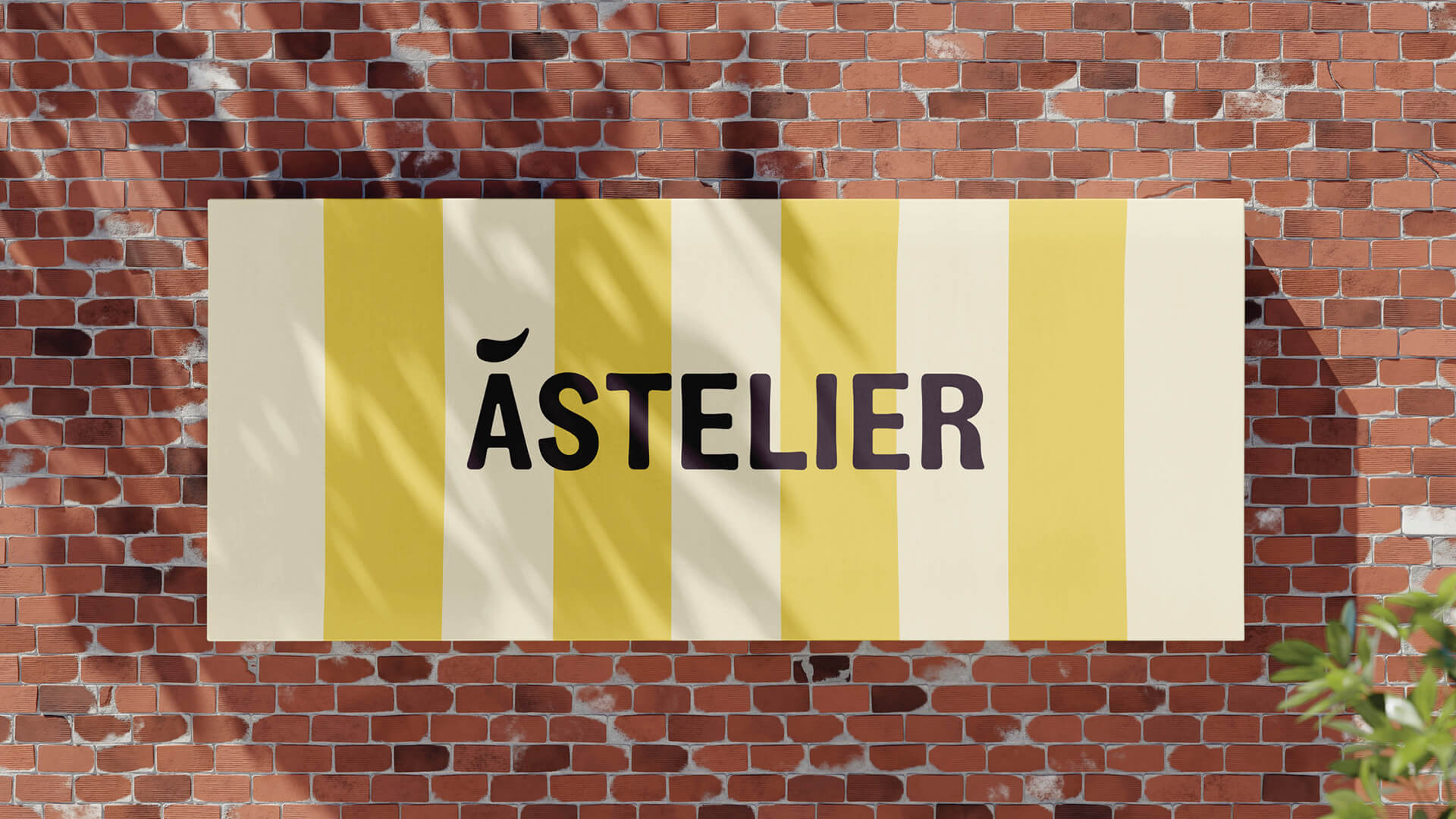
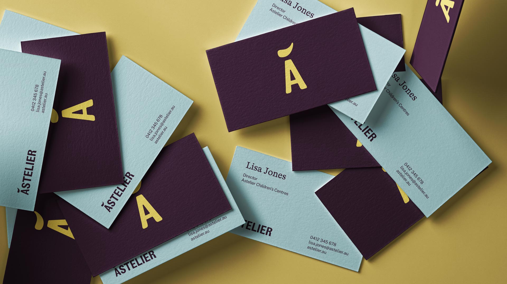
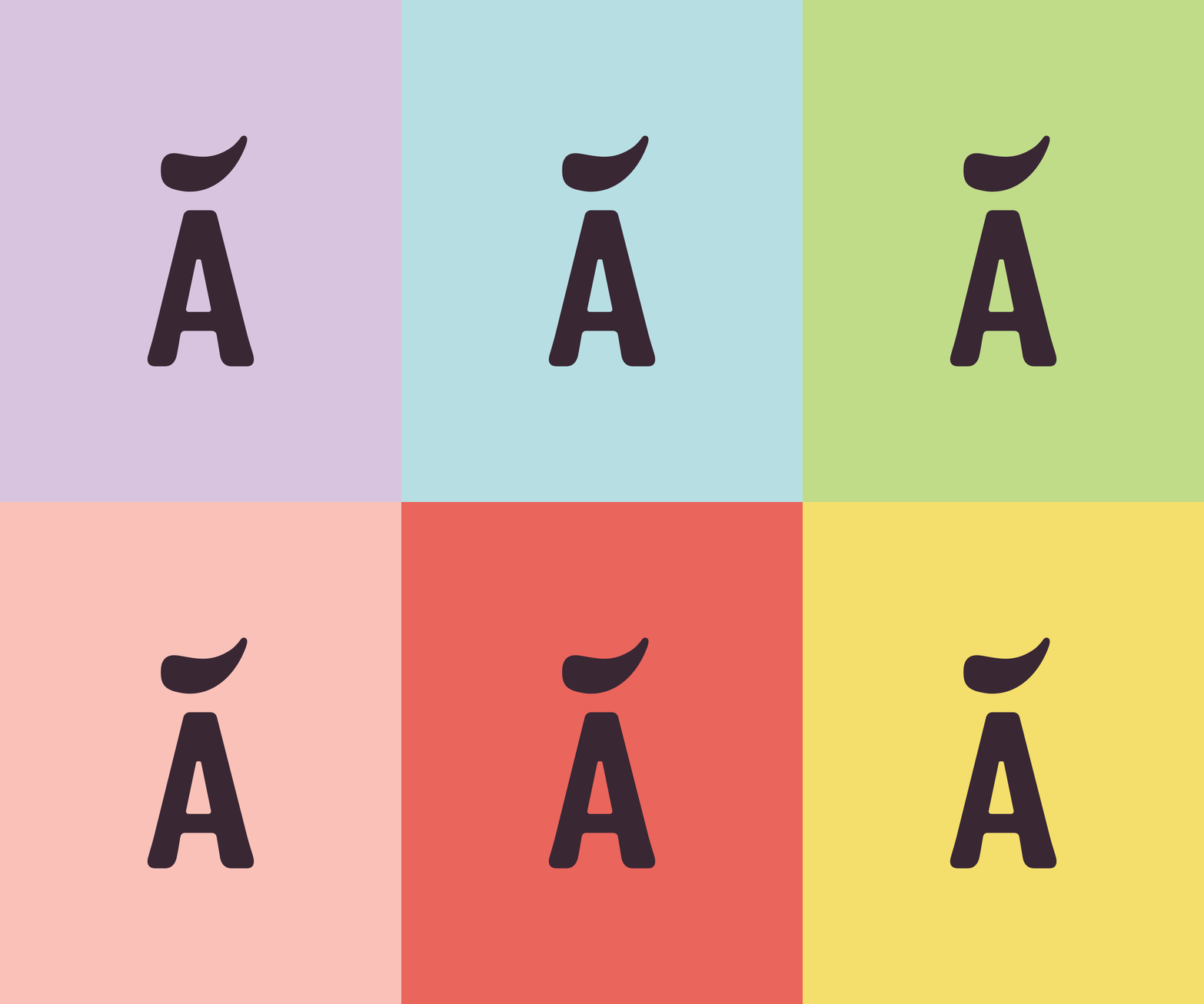
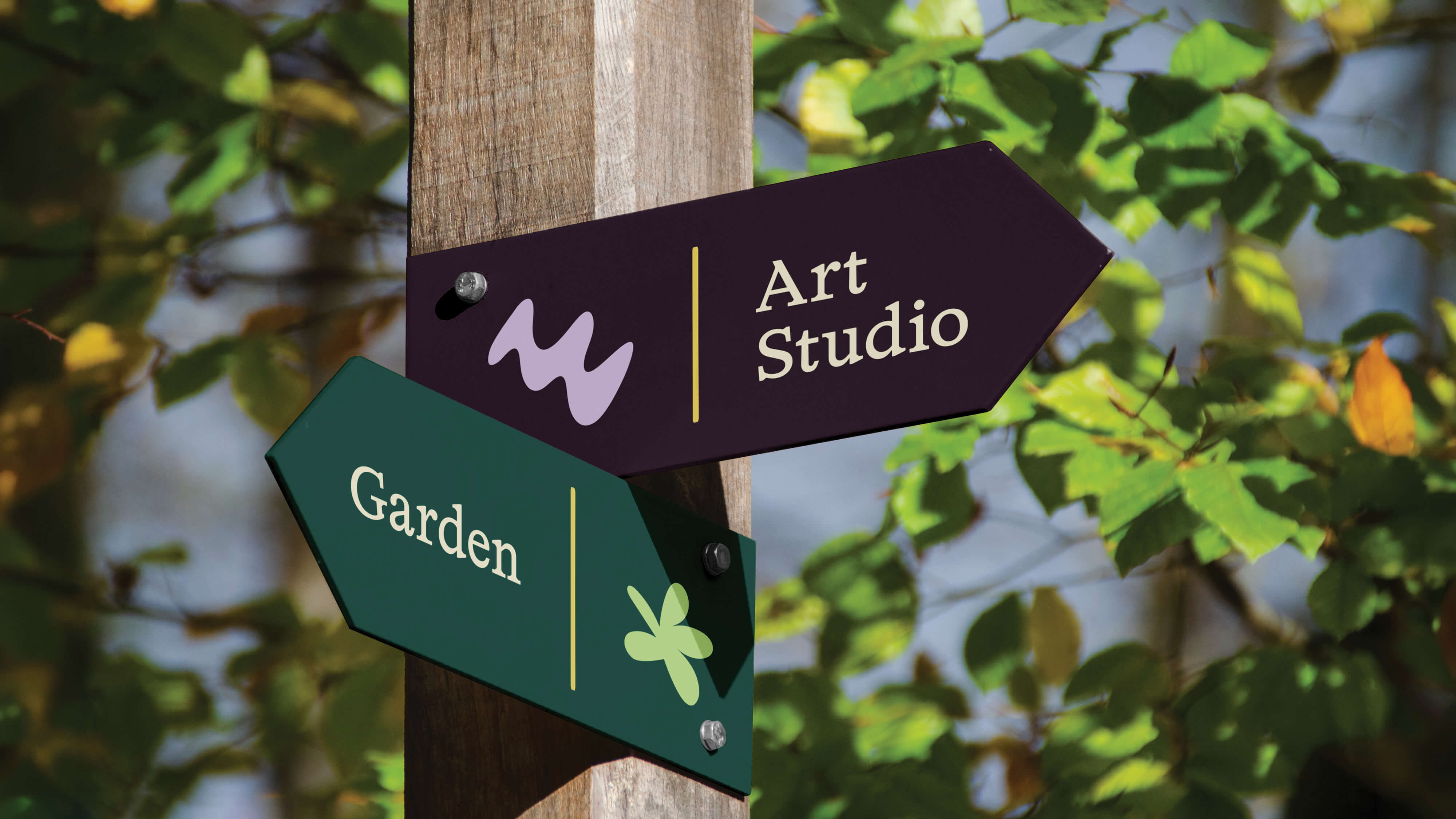
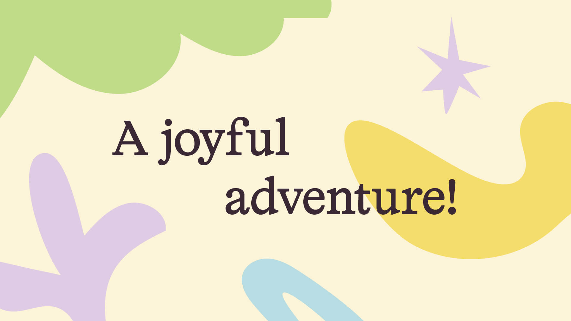
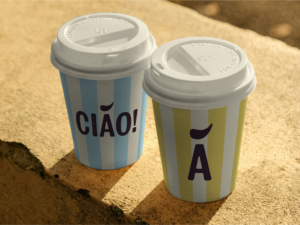
We built Astelier around a simple idea: learning is a joyful adventure. The name echoes atelier, the workshop of a craftsperson, where things are made slowly by hand and skill is handed down from one generation to the next. That’s the promise. A paintbrush mark above the “A” holds the creative energy and artistic expression, paired with a traditional-inspired supporting font that brings trust to the personality.
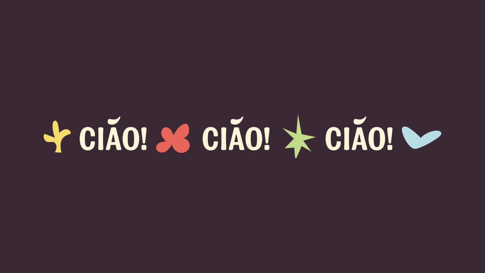
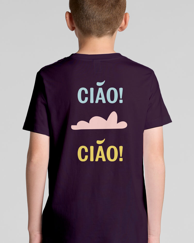
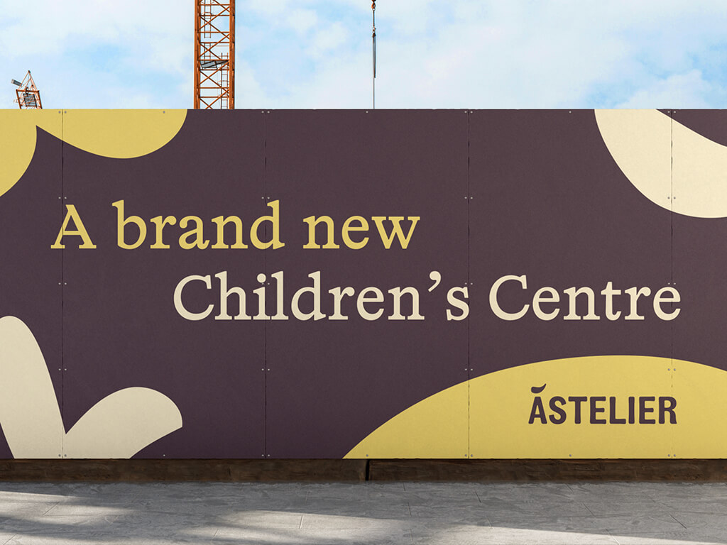
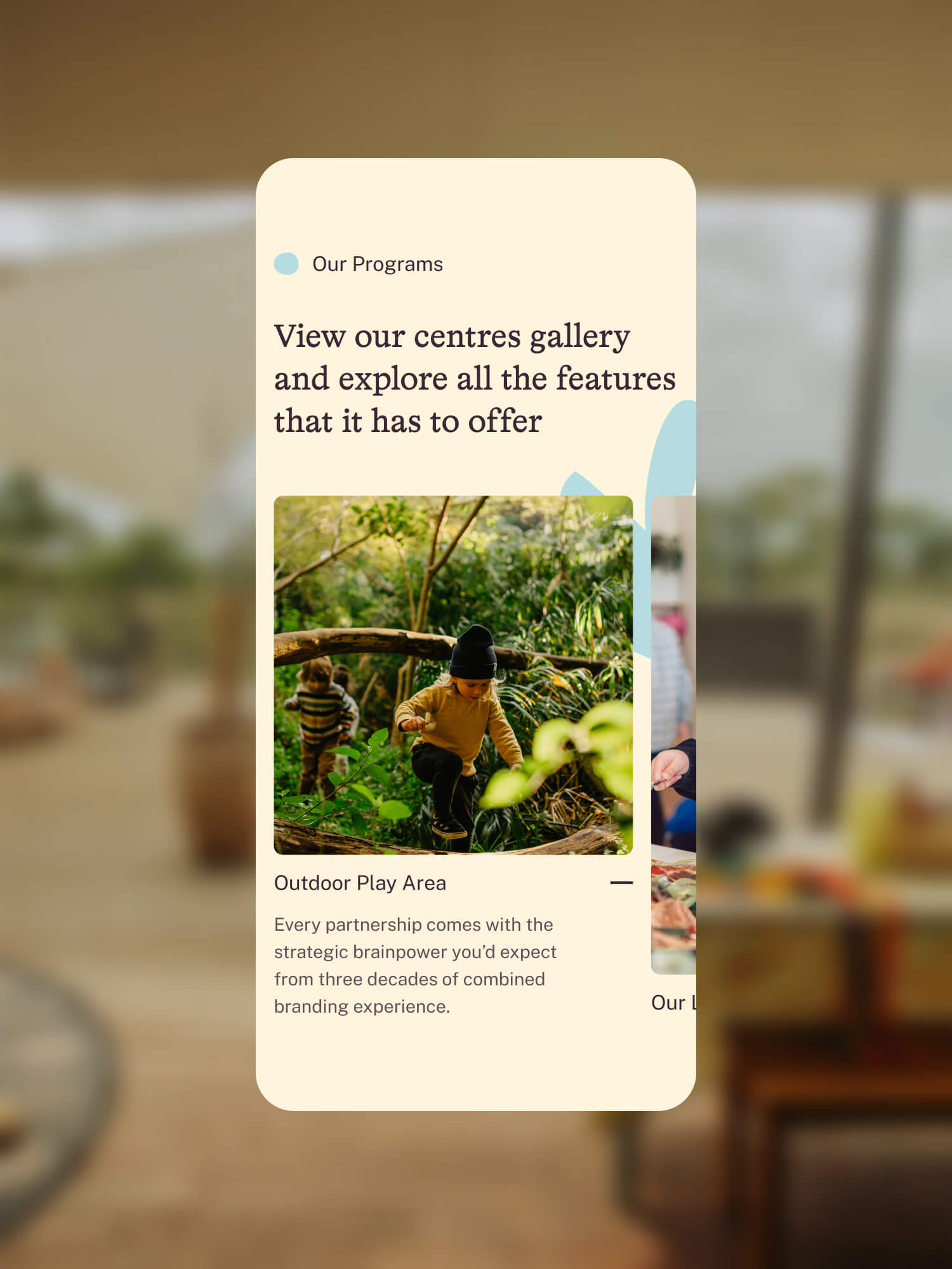
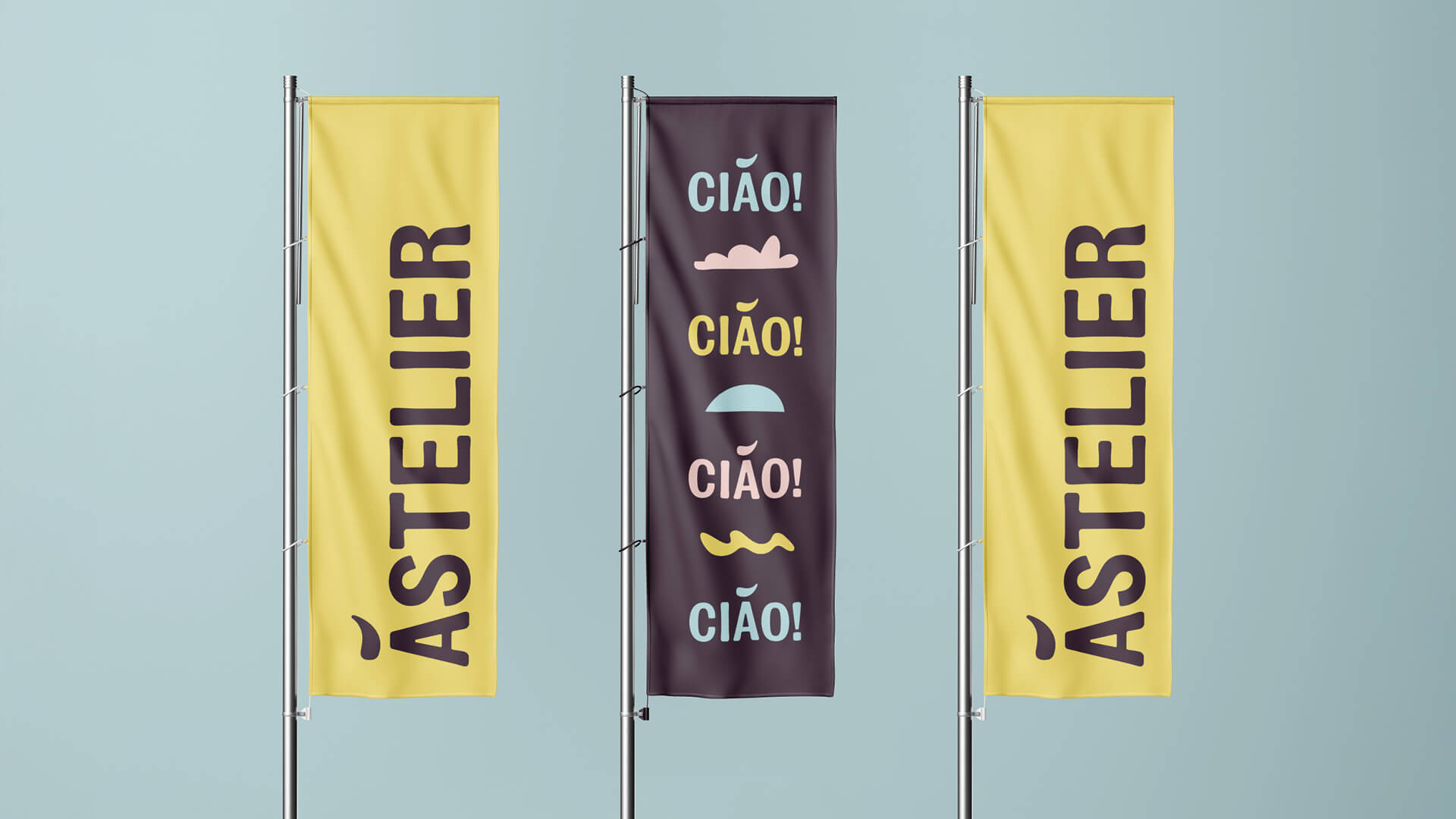
The palette takes its cue from the coast rather than the toy aisle: sun-warmed, a little bit worn in, fun but sophisticated, with a pared-back version for more formal applications. Supporting elements drawn from the work of Matisse bring playfulness and energy throughout the brand.
The result is a brand that’s fun enough to delight children, and refined enough for their parents.